This week Google Docs introduced Pivot Tables, an Excel feature that has been missing for some time. Pivot tables come in handy when you have a large spreadsheet that you want to summarize. The process works by allowing you to rotate data and view it from multiple angles, and when you look at data from different angles it might open up some opportunity to see patterns that weren’t so obvious before. Google actually already created a video that sums up the process quite nicely, see it below.
If you don’t like YouTube, or the video format didn’t work; we have the text-edition below. We’re using Google’s template as an example in this tutorial.
Step 1
First you’ll need to make your database. Since pivot tables are useful in situations where you have a large quantity of data, you can make this as big as you need to.
Step 2
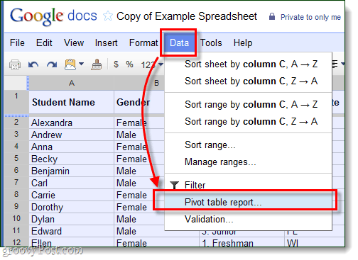
Now that your spreadsheet is full of your information, Select everything (all of your rows and columns) and then on the menu bar Select Data > Pivot Table Report.
Step 3
Google Docs will now add a new sheet onto the document (shown at the bottom left of the browser). The new sheet should be called Pivot Table 1 and it will have a new tool, Report Editor, on the right-pane. Working with the Report Editor is a lot like building a miniature table. Select your Rows and Columns, and then the data that goes along with them. Just watch which rows and columns you select, because if you add too much detail it goes against the whole point of creating a pivot table.
Step 4
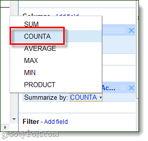
When adding Values to the pivot table, you’ll likely need to change the Summarize by setting. If you want actual statistics and totals to show up, choose COUNTA.
Conclusion
Pivot tables are the best way to simplify data-heavy spreadsheets. Setting up pivot tables in Google Docs is simple and new, but it still doesn’t do the job that Microsoft Excel or Open Office could.
Comment Name * Email *
Δ Save my name and email and send me emails as new comments are made to this post.


